The 20 Rules of Design
20 Rules of Design...
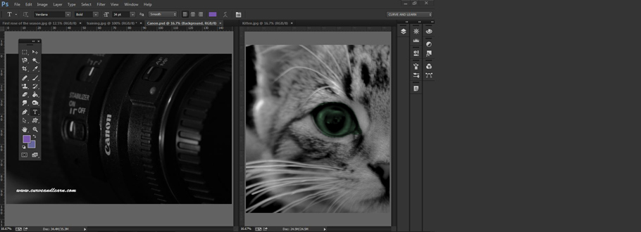
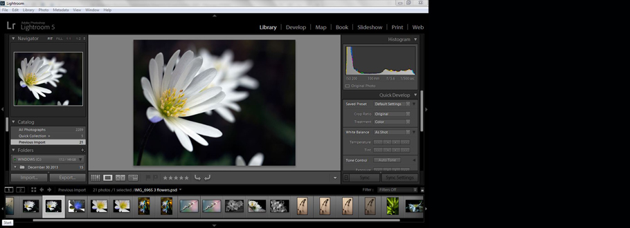
Learning to use new software is great but regardless of whether its an InDesign, PhotoShop or Illustrator course one question arises early on. What is good design and how do I use it? As with everything personal taste and visual perception have much to do with it however there is a fundamental guideline known as the '20 Rules of Design'. If you're new to the world of design then it probably feels like you are standing outside the Alamo facing Santa Ana's gattling guns.
Quote................"Rules can be broken but never ignored" - David Jury
So we thought our clients (old, new and those yet to be) might like to take a leisurely look at the various principles in good design. Over the next 20 weeks, each week we're going to take one rule of design, explain it and give examples of how its used in the design process. This week we're starting with the plain and simple 'line'.............is it plain and simple or is there more to the line than meets the eye.
Rule of Design 1...Lines
Lines are used to give a sense of movement and direction...
To direct the eye...
And emphasise an element on the page...
Lines are often described as the most basic elements of design and like 'leading lines' in photography are used to draw the viewer in. They are simple but when used in design can create both complex functions in a more than linear way. If you actually sit down and think and look then you can see that most things have a line in them somewhere which be used to draw out the most exotic and dramatic of layouts when used imaginatively.
Lines organise, connect, seperate both information and design elements...
Lines convey movement, texture, emphasis & define shape...
Lines can convey mood & emotion...
Example of using Lines...
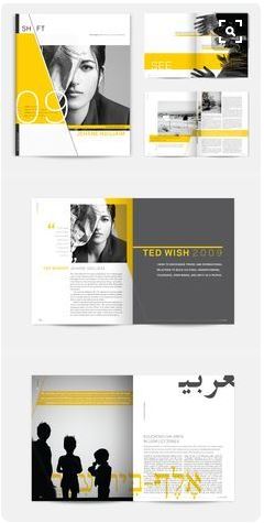
The wonderful diagonals in this design from Shift Magazine show how lines are used to pull the eye in by creating an extreme complex layout by making it look simple. The diagonal shape and lines on the front page demonstrate and awesome display of layout and control using grids in the background. The additional use of bright but warm yellow combined with the greys combine to create a stunning but simple masterpiece of work.
Another great design example of lines...
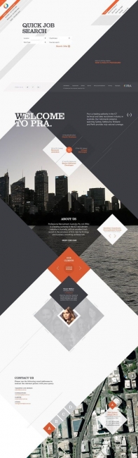
Leading lines in photography draw you and lead your eye in and through the image. The web example shows below how the designer worked with diagonals using powerful lines that draw the eye down through the page, section by section in a zig zag method.
Lines, Circles and Geometrics...
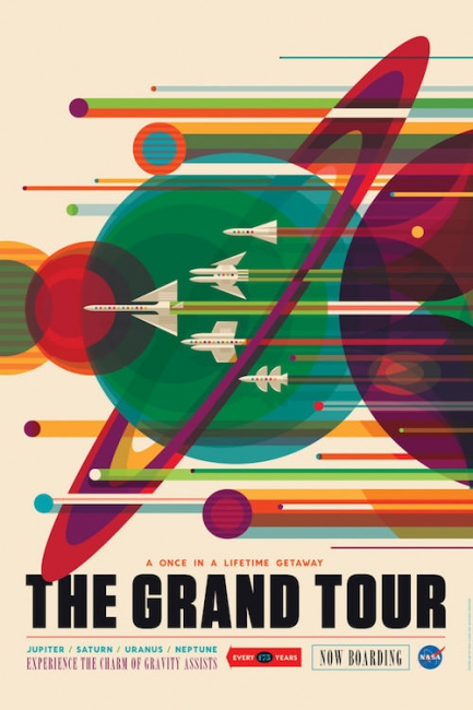
This retro dramatic poster owes most of its appeal to the clever use of the lines which again are simple but well drawn and with the circles give an extremely retro feel to the whole design.
All image credit belongs to Gizmodo for use of this poster
So what is a line?..
It can be made of dots, hashes, straight lines in colour or holding a pattern but the best way to think about lines in design is probably like this.
A Decorative Line...
Use to emphasise or elaborate an piece of text an underline of one or more lines) or design object (border, corner angles).
Contour Line...
Something that defines and edge or corners when two are connected they can create and define corners. Quite often these are used to define a border around areas such as a photo or to break the body of a website up by using a footer area.
Dividing Line...
These break up and define different parts of a page or a design and lines are used to define the gutter between text columns or as rules between paragraphs.
Implied Line...
This is a line that is there but not there - it works when various page objects are positioned or aligned in such a way that the eye is drawn along the invisible line.
Psychic Line...
These works when objects create motion along a line - for example an arrow pointing toward another spot on the spead cause your eye to follow the line to its natural end
Horizontal lines give the impression of stablity whilst vertical ones imply motions with the diagonal giving the feel of dynamic motion and depth. Horizontals and verticals can give a stablising effect and reduce the impression of movement.